User Experience Design
UCCS Program Page Redesign
Led a team of three through a semester-long class competition to redesign UCCS's program page template. From initial sketches through a polished Figma prototype, the design was selected as the winning submission and presented to a university stakeholder — earning recognition as the strongest solution among competing teams.
Project Objectives
- Redesign the UCCS program page template to improve navigation and visual consistency
- Create wireframes, lo-fi, and hi-fi prototypes in Figma
- Present the final design to a university stakeholder
- Produce a reusable template applicable across all UCCS department pages
Problem
UCCS's existing program pages suffered from poor navigation and an outdated visual design that no longer reflected the university's needs. The pages lacked consistency across departments, making it difficult for prospective students to find information and understand what each program offered. The university's stakeholders wanted something fresh, modern, and scalable — a template that could be applied across all program pages without requiring individual redesigns each time.
My Process
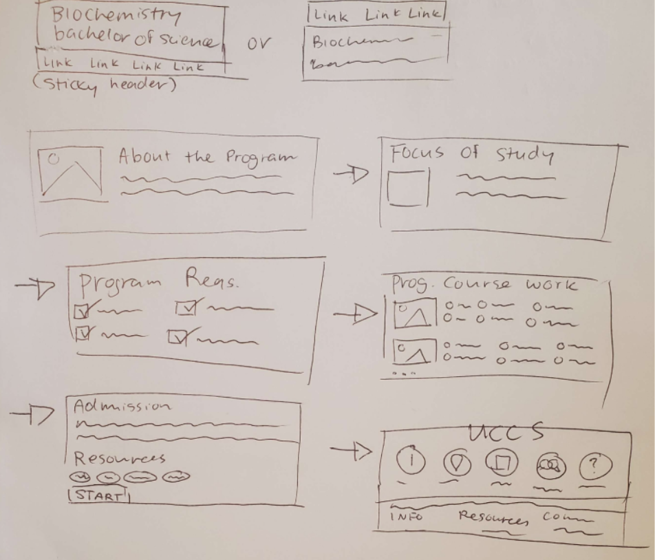
Sketching
The project began with each team member independently sketching drafts of what the site should look like. My sketch was selected by the group as the strongest foundation — establishing the overall layout, information hierarchy, and navigation structure that would carry through to the final design.

Lo-Fi Prototype
From the sketch and wireframe, each team member developed their own lo-fi prototype. My lo-fi was chosen as the direction to move forward with. This stage focused on refining the layout, clarifying the content structure, and establishing a clear visual flow before adding any design polish.
View Lo-Fi PDF →Hi-Fi Prototype in Figma
The hi-fi was built entirely in Figma. I took the lead on translating the lo-fi into a fully designed, interactive prototype — applying typography, color, spacing, and component structure to create a polished, presentation-ready design. A real department page was used as a content placeholder to demonstrate how the template would function in practice.
View Hi-Fi PDF →Presentation
I designed the presentation deck, wrote the script, and led the delivery to the university stakeholder. The presentation walked through our research, design decisions, and the rationale behind the template structure — making the case for why this approach would serve UCCS's needs across departments.
View Presentation →Key Decisions
Designing for Scalability
Rather than designing a one-off page, the core decision was to treat this as a reusable template from the start. Every layout choice was made with the question: could this work for any program page on the UCCS website? That constraint pushed the design toward clearer information architecture and more flexible components.
Prioritizing Navigation
The original pages buried key information and made it hard for users to orient themselves. The redesign brought navigation to the forefront — making it immediately clear where users were, where they could go, and how to take action. Simplifying the page structure was the single biggest usability improvement.
Final Deliverable
UCCS Program Page Template
Format
Hi-Fi Figma Prototype
Presented To
UCCS Stakeholder
Status
Pending Implementation
Outcomes
The design was selected as the winner out of other competing teams and presented to a UCCS stakeholder, who confirmed interest in implementing the template. The project earned a final grade of 110% — the extra credit awarded for the competition win.