UX Research
PPORA Research Report
Conducted end-to-end user experience research for the Pikes Peak Outdoor Recreation Alliance (PPORA) Data Hub — known as the Outdoor Pikes Peak Initiative (OPPI). Using persona development, journey mapping, and moderated usability testing with three participants, the report surfaced critical barriers in navigation, terminology, and layout clarity, and delivered evidence-based recommendations to improve the platform's accessibility and reach.
Research Objectives
- Investigate how intended users engage with the OPPI Data Hub to locate and interpret natural resource data
- Develop a user persona and journey map grounded in real user behaviors and pain points
- Conduct moderated usability testing with three participants across diverse backgrounds
- Identify key friction points in navigation, terminology, and visual layout
- Deliver actionable, evidence-based recommendations to PPORA stakeholders
Background
The Pikes Peak Outdoor Recreation Alliance (PPORA) maintains the Outdoor Pikes Peak Initiative (OPPI) Data Hub — a GIS-based platform providing natural resource data for the Pikes Peak region, including fireshed information, wildlife exposure zones, and outdoor recreation resources.
While the hub provides valuable datasets, early feedback suggested users encountered significant barriers related to navigation, jargon-heavy content, and overwhelming visual density. This research was commissioned to investigate those barriers and propose targeted improvements.
User Persona
A composite persona was developed to represent the hub's primary audience — community members with general digital literacy but no prior GIS or data hub experience.
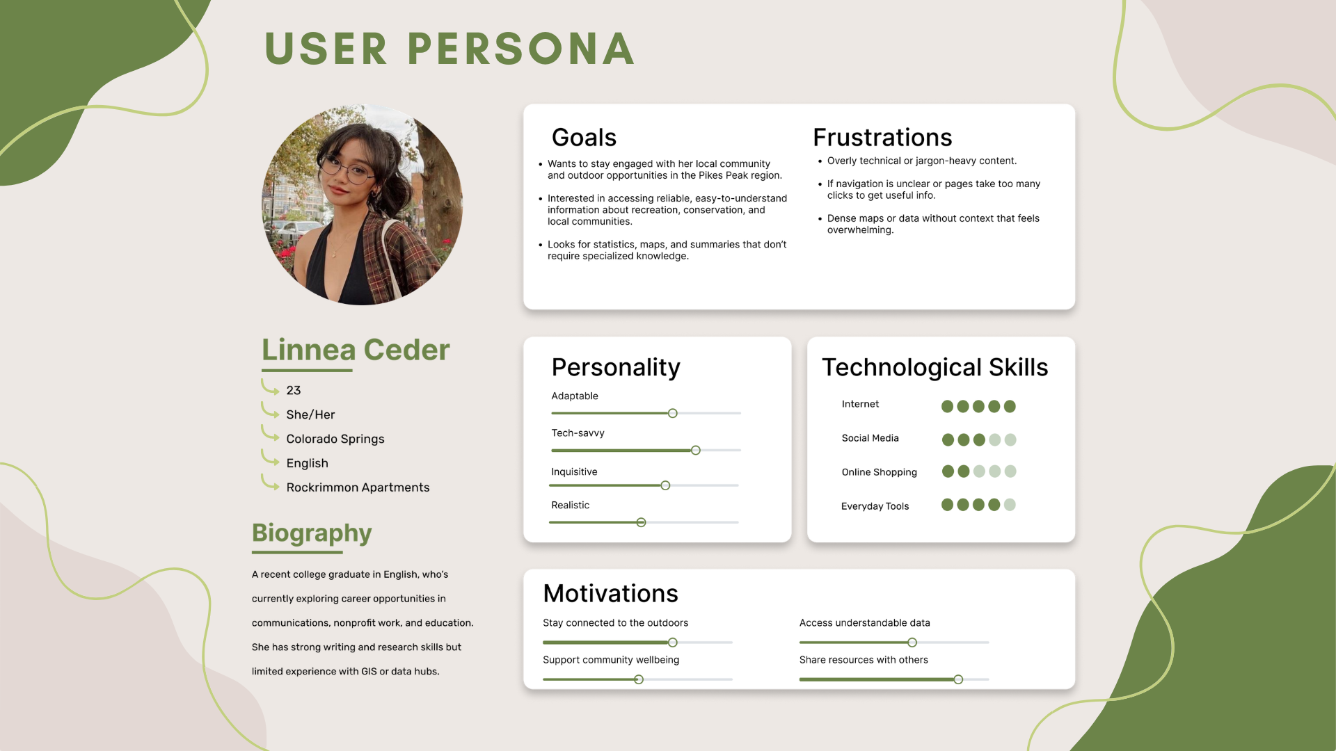
Goals
Stay engaged with local outdoor opportunities. Access reliable, easy-to-understand information about recreation, conservation, and community. Find statistics and maps without needing specialized knowledge.
Frustrations
Overly technical or jargon-heavy content. Unclear navigation requiring too many clicks. Dense maps or data without context that feels overwhelming.
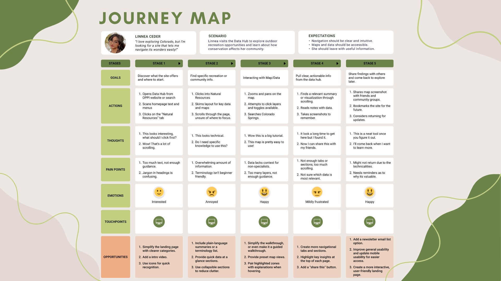
Journey Map
A five-stage journey map was built around the persona's experience navigating the OPPI Data Hub — from landing on the homepage through to sharing findings with others. The map captured goals, actions, thoughts, pain points, emotional responses, and opportunities at each stage.
Testing Participants
Three participants with deliberately diverse backgrounds were recruited to reflect the hub's broad intended audience — from a domain expert to a complete novice.
Dakoda
Engineer — VESA
Age 24. Experience with data hubs. Very familiar with outdoor recreational sites. High GIS familiarity.
⏱ 5 minutesAmi
Food Service Worker
Age 22. No prior experience with data hubs. Some interest in outdoor recreation. Rarely uses natural resource data.
⏱ 20 minutesVictoria
UCCS Student
Age 19. Limited experience with data hubs but demonstrates curiosity. Rarely uses natural resource data.
⏱ 16 minutesTesting Scenario & Tasks
Participants were asked to complete five tasks as Colorado Springs residents exploring the Natural Resources tab of the OPPI Data Hub:
Task 1
Find the most recent data available about Firesheds.
Task 2
Explore information about the risks and rewards of firesheds.
Task 3
Consider how wildlife may be impacted by fireshed risks.
Task 4
Find the Natural Resource Data Hub and identify what information it provides.
Task 5
Explore the Fireshed Land Ownership map and extract insights from it.
Feedback Methods
Think-aloud during tasks (concurrent), post-task interview questions (retrospective), and researcher observation of errors, hesitations, and frustrations.
Participant Findings
Dakoda
"It'd be great if there was a search bar."
Dakoda completed all tasks in 5 minutes but quickly identified major structural flaws. He found overlapping elements, excessive scrolling, and unclear organization. Even as an experienced data hub user, he struggled with hidden links and missing search functionality.
| Metric | Score (0–5) | |
|---|---|---|
| Ease of Navigation | 1 | |
| Confidence in Completing Tasks | 2 | |
| Overall Use | 1 | |
| Overall Satisfaction | 0 |
Ami
"I honestly didn't even know this link was here."
Ami spent 20 minutes on the site and found the layout disjointed and confusing. She appreciated the information but criticized the small scrollable boxes, poor use of space, and lack of context for links and maps. She frequently scrolled past critical content and misidentified the footer as more page content.
| Metric | Score (0–5) | |
|---|---|---|
| Ease of Navigation | 1 | |
| Confidence in Completing Tasks | 2.5 | |
| Overall Use | 1 | |
| Overall Satisfaction | 1 |
Victoria
"This site has a lot of scrolling, and I didn't even see these tabs."
Victoria completed all five tasks in 16 minutes but expressed strong frustration throughout. She struggled to find key information, couldn't locate the definition of "fireshed," and found the interface cluttered, overly technical, and visually unappealing. She was the most vocal participant — providing some of the report's most actionable feedback.
| Metric | Score (0–5) | |
|---|---|---|
| Ease of Navigation | 1 | |
| Confidence in Completing Tasks | 1 | |
| Overall Use | 1 | |
| Overall Satisfaction | 0 |
Recommendations
All three participants — regardless of experience level — encountered the same core barriers. These six recommendations target the most consistent and critical pain points.
🗺️ Improve Navigation Structure
Reorganize the site into clear, distinct sections with consistent labeling and a simplified nav bar. Reduce overlapping items and excessive scrolling.
📖 Enhance Readability & Visual Hierarchy
Apply larger legible fonts, concise paragraphs, and clear headers throughout. Make information easier to scan and reduce cognitive load.
💬 Clarify Data & Terminology
Add plain-language definitions next to specialized terms like "fireshed" and "elk severe winter range" so all users can interpret data without prior domain knowledge.
🧹 Refine Visual Layout
Reduce visual clutter by improving alignment, grouping related elements, and removing unnecessary graphics. Balance white space to guide rather than confuse.
🔍 Add Search & Filters
Implement a prominent search bar and filterable data categories so users can locate specific information efficiently without scrolling the entire page.
📄 Separate Content into Pages
Break the single long-scroll layout into individual pages with clear categories. Reduce scrolling fatigue and help users understand where they are in the site.
Final Deliverable
PPORA Data Hub — UX Research Report
Format
20-Page Research Report (PDF)
Includes
Persona, Journey Map, 3 Usability Tests, Recommendations
Audience
PPORA Stakeholders & Platform Developers
Outcomes
The research delivered a complete, presentation-ready UX report to PPORA stakeholders — grounded in real user data across three diverse participants. The findings revealed that usability barriers were consistent regardless of technical background, making the case for fundamental structural improvements rather than surface-level fixes.