UX Research
Dayforce Usability Report
Designed and authored a usability report for the Dayforce mobile app, synthesizing findings from moderated task-based testing sessions with three participants. The report identified key friction points in navigation, calendar access, and PTO visibility — and proposed actionable interface improvements backed by user data.
Test Objectives
- Assess the usability of viewing shift schedules within the Dayforce mobile app
- Evaluate how well employees can locate and understand their paycheck information
- Assess access to PTO data and timesheet hour totals
- Gather overall user satisfaction data and propose design improvements
Background
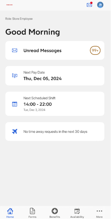
Dayforce is a human capital management (HCM) application widely used by organizations for employee data management, payroll, time tracking, and more. While it offers a comprehensive feature set, its interface has received feedback indicating it can be difficult to navigate — particularly for non-technical users or those with limited HCM experience.
Dayforce requested a usability test to address these issues, aiming to identify specific usability problems such as confusing navigation, inefficiencies in task completion, and difficulty finding important features — and to propose actionable design changes to make the app more user-friendly.
Methodology
Testing was conducted in the breakroom at Trader Joe's. Three crew members participated, completing pre-test questionnaires, four scenario-based tasks, post-test instruction scales, and a system usability scale. Testing took 15–20 minutes per participant and was largely unmoderated, though participants could ask questions if needed.
| Participant | Name | Title | Experience |
|---|---|---|---|
| A | Felipe A. | Crew Member | 2 months |
| B | Dave D. | Crew Member | 3 years |
| C | John B. | Crew Member | 4 years |
Tasks
Task 1 — Time Off Requests
Participants were asked to locate the time-off request tab and submit a mock request. All three found the actual request process straightforward, but unanimously agreed that navigating to the tab in the first place was unintuitive.
Task 2 — Schedule Access
Participants located their upcoming schedules without difficulty. However, all three flagged a core usability issue: the calendar displays all employee shifts rather than filtering to the individual user's shifts — making it harder to quickly identify their own schedule.
Task 3 — Timesheets
Participants A and B found their timesheets without issue. Participant C found the process less streamlined. All three struggled to easily identify their total hours worked from the timesheet view.
Task 4 — PTO Information
This was the most challenging task. Participant A was unable to locate their PTO information at all. Participant B had a neutral experience and eventually completed the task. Participant C found their accrued time off but could not determine whether it would cover a specific future period.
Key Findings
Calendar System
Displays all employee shifts rather than the individual user's — creating unnecessary noise and confusion when trying to view personal schedules.
Navigation Complexity
Multiple taps required to complete simple tasks. Key functions like time-off requests and PTO data are buried rather than surfaced on the homepage.
PTO Visibility
All three participants struggled to access their PTO balance. One participant could not locate it at all. No clear way to project whether accrued PTO covers a future period.
Timesheet Clarity
Users could find their timesheets but struggled to determine total hours worked at a glance — a critical piece of information for hourly employees.
Pre-Test Survey Results
Participants completed a questionnaire before testing to establish baseline familiarity and expectations.
Appendix A — Pre-Test Questionnaire
1. How familiar are you with the Dayforce scheduling interface?
2. How would you describe its usability?
3. How likely are you to interact with an updated interface?
4. Would you use Dayforce more if the interface was updated?
Open responses: Participants requested document access on mobile, user-friendly updates, and an updated UX design.
Post-Test Survey Results
Appendix C — Post-Test Instruction Scale
1. These tasks were easy to complete without instruction.
2. I found the tasks unnecessarily complex.
3. The tasks took a long time to complete.
4. I found it easy to navigate to the correct locations.
5. I struggled to find the correct locations.
6. The Dayforce app is intuitive for me to use.
7. I felt confident using Dayforce to complete my tasks.
Recommendations
Based on participant feedback and task performance, four key improvements were proposed:
Fix Navigation
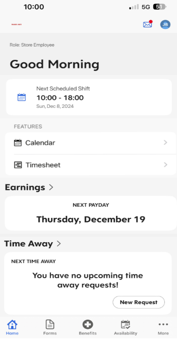
Create homepage tabs for key user functions — time-off requests, schedules, and timesheets — so they're accessible in one tap rather than buried in menus.
Update Calendar System
Filter the calendar view to show only the individual user's shifts by default. Add a quick weekly breakdown for at-a-glance scheduling.
Remove Redundant Features
Messages and Time-Away buttons appear repeatedly throughout the app, creating unnecessary confusion. Consolidate these into single, clearly labeled locations.
Mobile-First Cohesiveness
The current app mirrors the web interface rather than being designed for mobile. Rebuild key screens with a mobile-first layout to improve usability for on-the-go employees.
Final Deliverable
Dayforce Mobile App — Usability Report & Interface Mockup
Format
Formal Usability Report
Course
TCID 3100 — UCCS
Date
December 2024
Interface Mockup
A redesigned interface mockup was developed to illustrate the proposed improvements, positioning key features directly on the employee homepage and streamlining access to schedules, PTO, and timesheets.
Original Interface
Interface Mockup
Outcomes
The study produced a complete usability report with participant data, findings, and a redesigned interface mockup — delivered as a formal document for TCID 3100 at UCCS.